Back to blog
Best Of

6 Best Design Tools in June 2026

July 5, 2026
6 Best Design Tools in June 2026

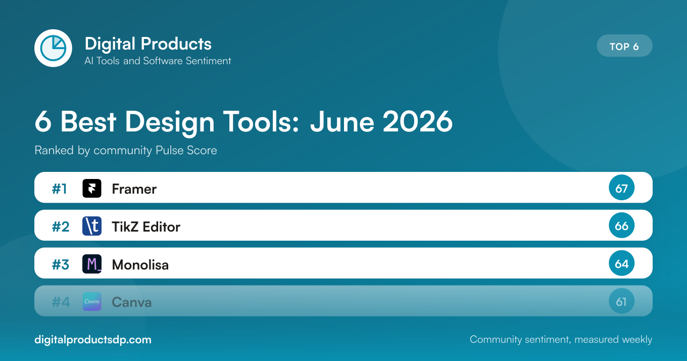
This ranking gathers the six design tools that generated the most positive public conversation during June 2026, ordered by their Pulse Score. A Pulse Score is a 0 to 100 summary of how the online community talked about a product across the month. It is not a lab test or a feature audit. It is a snapshot of sentiment: what people praised, what frustrated them, and how the overall tone leaned when the discussion was aggregated. Every number below comes from that public conversation, so read the ranking as a reflection of what people were saying rather than a declaration of which tool is technically superior.

To build the list we tracked mentions of each design tool from June 1 through June 30, 2026, classified the tone of each mention, and rolled the results into a single score. Tools needed a meaningful volume of discussion to qualify, which keeps thin or noisy samples out. What follows starts with the leaderboard, then reads the field as a whole, then works through each product in rank order with its score, its sentiment mix, and the themes people raised most often. Because sentiment analysis is imperfect and mention counts vary enormously between products, treat the gaps between neighbors as directional rather than precise.

RankProductCategoryPulse ScoreRelevant MentionsVisit
1FramerDesign6714Visit ↗
2TikZ EditorDesign6616Visit ↗
3MonolisaDesign6429Visit ↗
4CanvaDesign61269Visit ↗
5FigmaDesign53235Visit ↗
6WebflowDesign5067Visit ↗

Read together, the June field shows how differently a strong Pulse Score can be earned. The top three, Framer, TikZ Editor, and Monolisa, all cleared 64 points but did so on modest mention counts between 14 and 29, where a clean positive-to-negative ratio carries a lot of weight. The heavyweights, Canva and Figma, drew hundreds of mentions each, and that scale brings a wider spread of criticism that pulls their scores toward the middle. Webflow closes the list at 50, the only tool where negative discussion outweighed positive. In short, a small tool with focused praise can outrank a giant with divided sentiment, which is exactly why volume and score deserve to be read side by side.
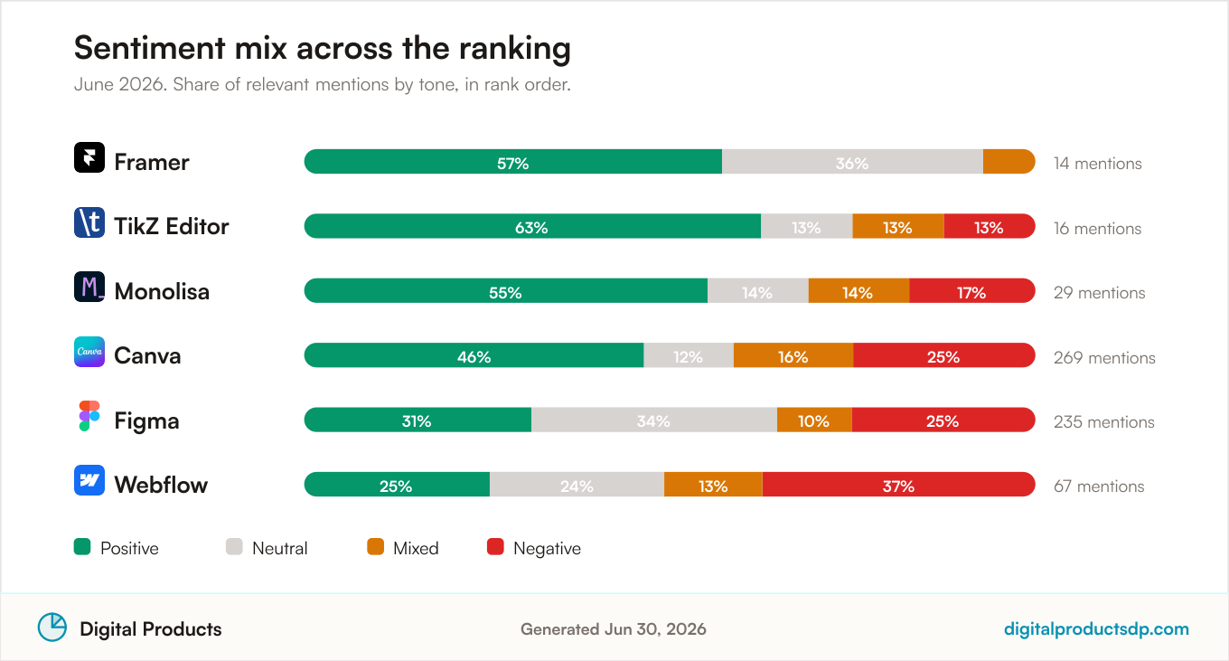
Positive, neutral, mixed, and negative discussion share for the 6 ranked Design Tools, June 2026

1. Framer

Framer Pulse Score trend from aggregated public discussion

Framer takes the top position with a Pulse Score of 67. What makes that number stand out is not raw volume but cleanliness. Across 14 tracked mentions, the sentiment mix ran 57% positive, 36% neutral, 7% mixed, and, notably, 0% negative. No other tool in this ranking managed a month without a single negative mention, and that absence of complaints is a large part of why Framer leads.

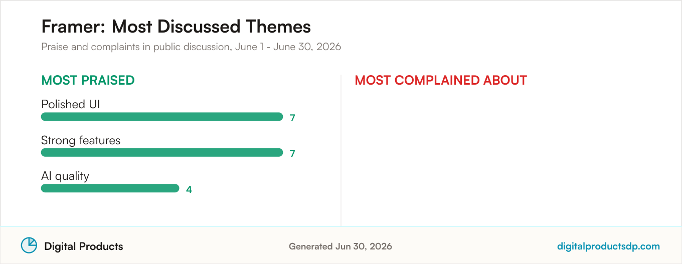
The praise clustered around three themes. Its polished UI drew seven mentions, its strong features drew another seven, and the quality of its AI features earned four. That combination suggests a community that likes both how the tool looks and what it can do, with its AI capabilities landing as a genuine plus rather than a gimmick. Because the sample is small, the reading is more fragile than the numbers alone imply, so a handful of mentions in either direction could shift the picture next month.

Still, on the evidence of June, public discussion around Framer was as warm as it gets in this category. There were no recurring criticisms to report, which is unusual and worth taking at face value for the period measured.

Most praised and most complained about themes for Framer from aggregated public discussion

Visit Framer

2. TikZ Editor

TikZ Editor Pulse Score trend from aggregated public discussion

TikZ Editor lands in second with a Pulse Score of 66, just a point behind the leader. Its 16 mentions actually skewed more positive than Framer's, with 63% of discussion positive, but that upside came alongside some friction. The rest of the mix broke down as 13% neutral, 13% mixed, and 13% negative, so this is a tool people enjoyed while acknowledging its rough edges.

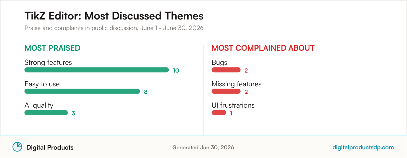
On the positive side, strong features led the conversation with ten mentions, followed by ease of use at eight and AI quality at three. That is a healthy profile for a specialist design tool: people found it capable and approachable at the same time. The criticism was lighter but present, with two mentions of bugs, two of missing features, and one about UI frustrations.

The takeaway from June is that TikZ Editor earned strong enthusiasm from those who used it, with a small pocket of complaints that kept it from matching Framer's spotless record. On this sample size, the second-place finish reflects a community that is largely satisfied but not uniformly so.

Most praised and most complained about themes for TikZ Editor from aggregated public discussion

Visit TikZ Editor

3. Monolisa

Monolisa Pulse Score trend from aggregated public discussion

Monolisa holds third with a Pulse Score of 64, and it does so on the strongest sample of the top three. With 29 mentions, its reading rests on nearly twice the volume of Framer and TikZ Editor combined, which makes its position a bit more stable. The sentiment split came in at 55% positive, 14% neutral, 14% mixed, and 17% negative.

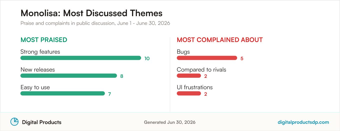
Discussion praised its strong features most often, with ten mentions, alongside eight mentions tied to new releases and seven for ease of use. The appearance of new releases as a top theme is worth noting: it suggests active development that the community noticed and responded to during the month. On the other side, bugs were the leading complaint with five mentions, followed by two comparisons to rival tools and two references to UI frustrations.

That 17% negative share is higher than the two tools ranked above it, and it explains the small gap. What keeps Monolisa firmly in the top tier is that its positive discussion stayed clearly dominant even with more mentions on the table, which is harder to sustain as volume grows.

Most praised and most complained about themes for Monolisa from aggregated public discussion

Visit Monolisa

4. Canva

Canva Pulse Score trend from aggregated public discussion

Canva sits fourth with a Pulse Score of 61, and its story is fundamentally different from the tools above it because of scale. With 269 mentions, it drew by far the most discussion in this ranking, and that volume brings a broader spread of opinion. Its sentiment mix ran 46% positive, 12% neutral, 16% mixed, and 25% negative. Holding a positive plurality across that many mentions is a meaningful signal of goodwill.

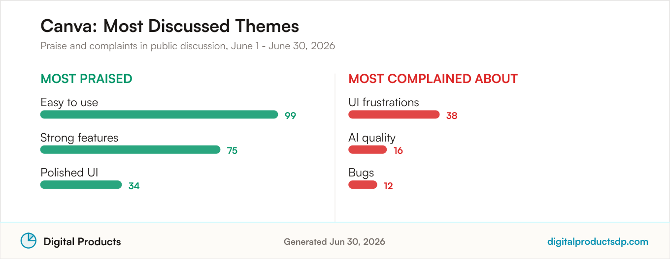
Ease of use dominated the praise with 99 mentions, a figure that dwarfs almost everything else in this article and underlines Canva's reputation as an approachable tool. Strong features followed with 75 mentions and polished UI with 34. On the criticism side, UI frustrations led with 38 mentions, AI quality drew 16, and bugs accounted for 12. The fact that the interface shows up both as praise and as a top complaint reflects how a large, varied user base can pull in opposite directions.

The 25% negative share is the second highest in the ranking, and it is what separates Canva from the more sharply positive tools above. When hundreds of people weigh in, disagreements surface that a small sample would never reveal. Read plainly, June discussion painted Canva as widely liked and widely used, with a real minority of frustration mixed in.

Most praised and most complained about themes for Canva from aggregated public discussion

Visit Canva

5. Figma

Figma Pulse Score trend from aggregated public discussion

Figma ranks fifth with a Pulse Score of 53, on 235 mentions. Its profile stands out for how much neutral discussion it carried: 34% of mentions were classed as neutral, edging past its 31% positive share. The remainder split into 10% mixed and 25% negative. A large neutral block often reflects a tool that people talk about in practical, matter-of-fact terms rather than in strongly emotional ones, which fits an industry-standard workflow tool.

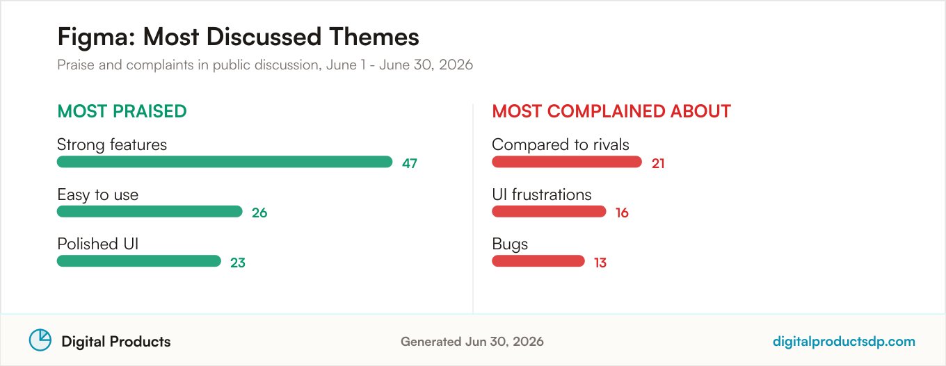
When people did praise Figma, strong features led with 47 mentions, ease of use followed with 26, and polished UI drew 23. The criticism was led by comparisons to rivals, with 21 mentions, which is the standout theme here. That volume of rival comparisons suggests a community actively weighing Figma against alternatives, a conversation that intensified for many teams over the past year. UI frustrations added 16 mentions and bugs another 13.

The gap between Figma and Canva comes down to that thinner positive share and the prominence of comparison talk. On these numbers, June discussion positioned Figma as capable and heavily used but caught in an ongoing debate about whether it remains the default choice.

Most praised and most complained about themes for Figma from aggregated public discussion

Visit Figma

6. Webflow

Webflow Pulse Score trend from aggregated public discussion

Webflow closes the ranking with a Pulse Score of 50, drawn from 67 mentions. It is the only tool in this list where negative discussion outweighed positive, with the mix running 25% positive, 24% neutral, 13% mixed, and 37% negative. That negative plurality is the defining feature of its June conversation and the reason it sits at the bottom of an otherwise positive field.

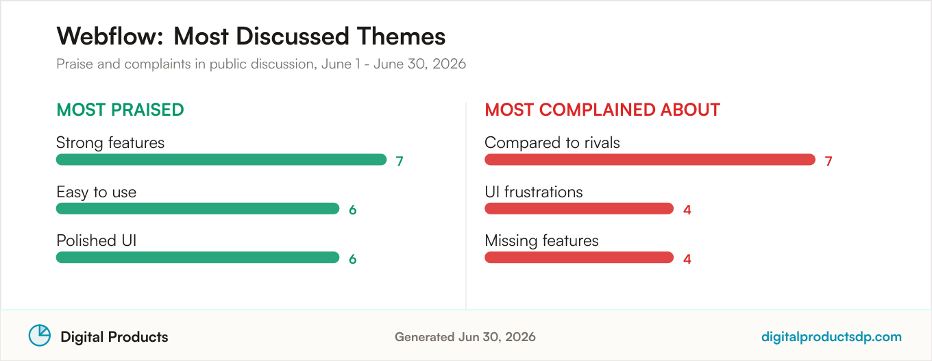
There was still praise to record. Strong features, ease of use, and polished UI each drew between six and seven mentions, a fairly even spread that shows the tool has clear advocates. But the complaints were more concentrated and more numerous. Comparisons to rivals led with seven mentions, matching the top praise theme in raw count, while UI frustrations and missing features each drew four. When comparison talk and feature gaps rise to the top of the conversation at once, it usually signals a community actively questioning whether the tool keeps up with its alternatives.

None of this makes Webflow a poor product, and a Pulse Score of 50 still reflects a genuine base of positive sentiment. It simply means that during June, the balance of public discussion leaned more critical than it did for any other tool ranked here.

Most praised and most complained about themes for Webflow from aggregated public discussion

Visit Webflow

How This Ranking Works

Every position in this list is decided by the Pulse Score each tool earned across June 2026. We collect public mentions of a product, classify the tone of each one as positive, neutral, mixed, or negative, and combine those signals into a single 0 to 100 score for the period. Tools are then ordered from highest score to lowest. That is the entire basis of the ranking order: Framer at 67, TikZ Editor at 66, Monolisa at 64, Canva at 61, Figma at 53, and Webflow at 50.

Because the score reflects tone rather than volume, a tool with a small but overwhelmingly positive conversation can rank above a much larger tool whose discussion is more divided. That is exactly what happened this month, with the three specialist tools at the top drawing between 14 and 29 mentions each while Canva and Figma each drew well over 200. The mention counts matter for how much confidence to place in each read, which is why we surface them alongside every score. A high score built on a large, positive sample is a sturdier signal than one built on a handful of mentions, and the reverse is also true.

We also weigh how positive the discussion mix is and which themes recur. Praise for features and ease of use lifts a score, while clusters of complaints about bugs, missing features, or comparisons to rivals weigh it down. None of this is a measurement of product quality. It is a structured summary of what people were saying in public during a fixed window of time.

About This Data

Pulse Scores summarize the tone of public online discussion on a 0 to 100 scale. They reflect community sentiment during a specific period, not a verdict on a product's quality and not a recommendation to buy or avoid anything. A high score means people were talking positively, and a low score means the balance leaned more critical or neutral.

We report on complete calendar weeks only. Products with fewer than 10 relevant mentions in the period are excluded, because very thin samples produce unstable reads that can swing wildly on a single comment. Ranked products also need at least two complete weeks of discussion data within the period, so a one-week spike in chatter cannot push a tool into the ranking on its own. These rules keep the list grounded in sustained conversation rather than momentary noise.

Public discussion is collected from Hacker News, Stack Exchange, GitHub, Bluesky, the Apple App Store, and YouTube. Automated sentiment analysis is not perfect. It can misread sarcasm, jokes, or niche context, and it can miss nuance that a human reader would catch. Mention volumes also vary widely between products, as this month's range from 14 to 269 shows, and scores can move from one week to the next as new discussion comes in. Treat everything here as directional rather than definitive. Any company that wants to respond to how its tool is represented is welcome to reach out.

Some Visit links in this article may be affiliate links, which means the site may earn a commission if you click through and sign up. This never influences Pulse Scores or rankings, which are generated from public discussion data before any commercial consideration. For a full explanation of how scores are calculated, see our methodology.

Frequently Asked Questions

Which design tool ranks first in June 2026 and why?

Framer ranks first with a Pulse Score of 67. It earned the top spot not on volume but on the tone of its discussion. Across 14 mentions, sentiment ran 57% positive with 0% negative, the only tool in this ranking to record a month without a single negative mention. Praise centered on its polished UI and strong features, each cited seven times, along with four mentions of AI quality.

How is this ranking calculated?

The ranking is ordered entirely by Pulse Score for the June 1 to June 30, 2026 period. We collect public mentions of each design tool, classify each as positive, neutral, mixed, or negative, and combine those into a single 0 to 100 score. Tools are then sorted from highest to lowest. Recurring praise raises a score while clusters of complaints lower it, and mention counts are shown so you can judge how much weight each read carries.

How often does the ranking update?

Scores are built from complete calendar weeks, and this edition covers the full month of June 2026. Because Pulse Scores can shift from week to week as new discussion comes in, the ranking is refreshed for each new reporting period. A tool that leads one month can move as its sentiment mix and mention volume change.

Does a high Pulse Score mean a tool is right for me?

No. A high Pulse Score means public discussion leaned positive during the period, not that the tool fits your specific needs. Framer topped the list on a small, glowing sample, while Canva scored 61 across 269 mentions with a much wider spread of opinion. The right choice depends on your workflow, budget, and required features. Use the scores and the praise and complaint themes as one input among several, not as a final answer.