Frequently Asked Questions
The following FAQs address strategies and principles for creating effective navigation structures.
What strategies can be employed to enhance site navigation for optimal user experience?
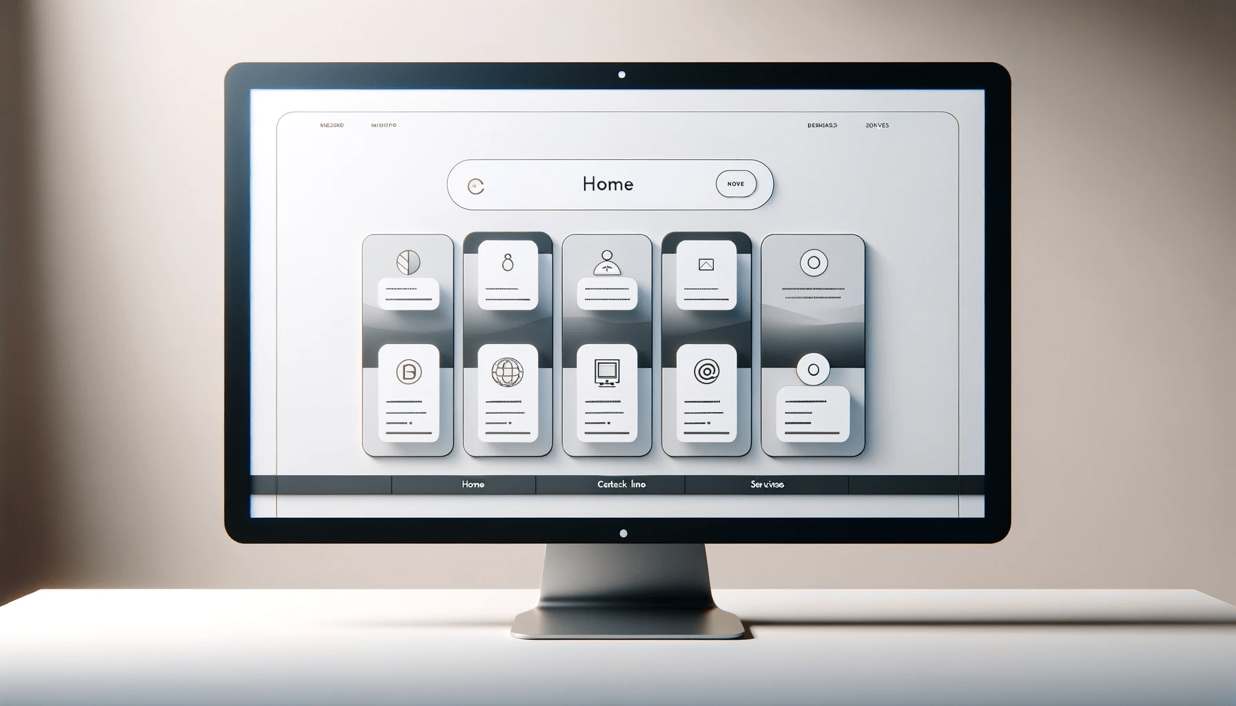
Improving site navigation involves simplifying the structure and flattening your navigation to allow for easier access to all pages. Incorporating a search function and using clear, descriptive labels for links and categories also lead to a more intuitive navigation experience.
Which design principles are crucial to follow when creating intuitive website navigation?
Consistency in design and layout across the website helps users learn the navigation system quickly. A global navigation approach ensures the primary navigation elements are accessible from every page. Logical grouping of related content and functionality enhances discoverability.
How can we utilize UX patterns to improve the navigational structure of a website?
UX patterns, such as breadcrumbs, mega menus, and card layouts, guide users effectively through the site's hierarchy. These design patterns provide visual cues and clear pathways, reducing cognitive load and enhancing UX.
In what ways can website navigation be optimized to facilitate a smoother user journey?
Optimizing navigation includes minimizing the number of clicks required to reach a destination, using predictable navigation layouts, and highlighting the current location within the site's architecture. These measures all support a smoother, more efficient user journey.
What are effective methods to streamline navigation for complex websites with multiple sections?
For complex websites, functionality such as sticky menus, accordions, and drop-downs can compress space and present a clean interface. It's also beneficial to limit the number of menu items to prevent information overload and to prioritize content according to user needs.
Can you outline the steps for conducting a navigation usability test to improve website UX?
Conducting a usability test involves defining objectives, recruiting participants that match the target audience, creating tasks that reflect typical user behavior, and observing interactions. Subsequent analysis identifies pain points and opportunities for improvements in navigation and UX.
• Navigation in Websites
• Navigation is So Important
• Your User Behavior
• Structuring Information
• Practicality Comes First
• Navigation Menu
• Testing and Feedback
• Final Thoughts