Design tools sit at the center of how teams and individuals turn ideas into finished work, and few matchups draw more attention than Figma against Canva. One leans toward professional interface design and collaboration, the other toward fast, accessible creation for a broad audience. To see how each was received in public discussion during the week of June 1 to June 8, 2026, we pulled aggregated sentiment data and compared the two side by side.
The numbers below reflect the tone of online conversation, not a technical audit of either product. They capture how people talked about these tools across public platforms during a single calendar week. With that framing in mind, here is how Figma and Canva stacked up.
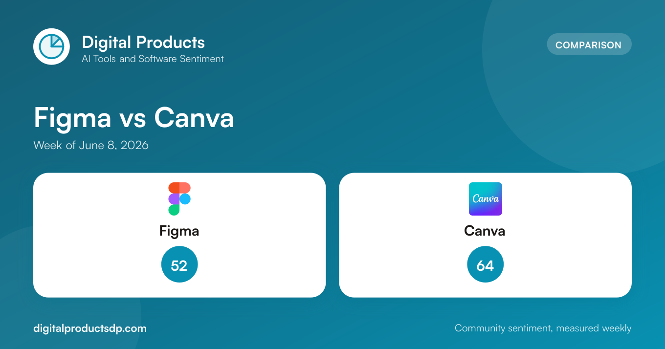
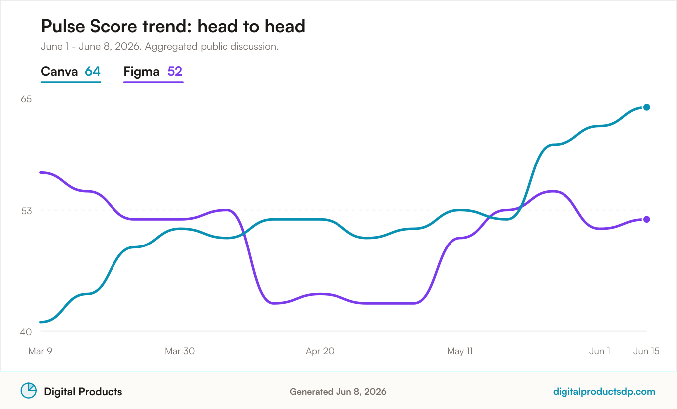
Figma carried a Pulse Score of 52 for the week, drawn from 384 total mentions. That is the larger conversation of the two by a wide margin, which is not surprising given Figma's central role in professional product and interface design workflows.
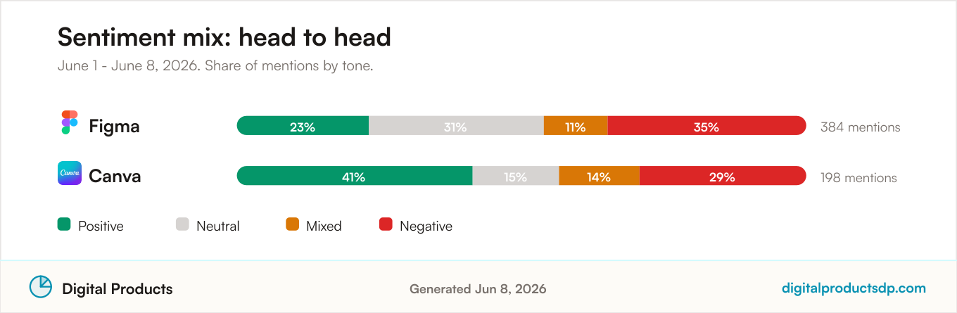
The sentiment mix was notably split. Only 23% of mentions were positive, while 31% were neutral, 11% were mixed, and a substantial 35% were negative. In other words, negative discussion slightly outweighed positive discussion during this period, which pulled the Pulse Score toward the middle of the scale.
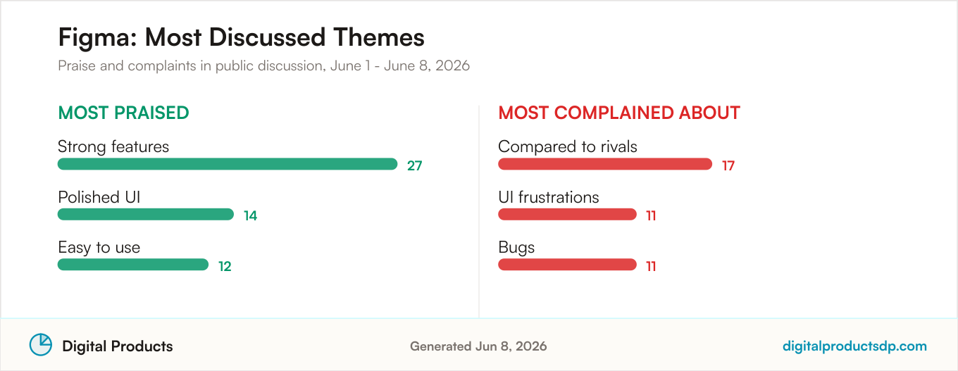
On the positive side, the themes people raised most often were Strong features (27 mentions), Polished UI (14 mentions), and Easy to use (12 mentions). These point to a tool that many users still respect for its depth and craft.
The complaints, however, were louder than usual. The most common criticism was Compared to rivals (17 mentions), suggesting people were actively weighing Figma against alternatives. That was followed by UI frustrations (11 mentions) and Bugs (11 mentions). The presence of comparison-driven complaints at the top of the list is worth noting, because it implies part of the negative sentiment came from users questioning whether Figma remained the best fit for their needs.
Canva
Canva posted a higher Pulse Score of 64, built from 198 total mentions. That is roughly half the discussion volume of Figma, but the tone of that conversation was clearly warmer.
Canva's sentiment mix leaned positive: 41% of mentions were positive, 15% neutral, 14% mixed, and 29% negative. The positive share nearly matched Figma's positive and neutral shares combined, and the negative share, while still meaningful at 29%, sat below Figma's 35%.
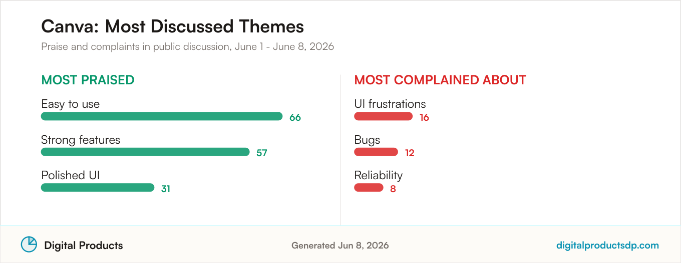
The praised themes tell a consistent story. Easy to use led decisively with 66 mentions, followed by Strong features at 57 mentions and Polished UI at 31 mentions. Ease of use dominating the positive conversation aligns with Canva's reputation as an approachable tool for people who want results without a steep learning curve.
Complaints for Canva centered on UI frustrations (16 mentions), Bugs (12 mentions), and Reliability (8 mentions). These are the kinds of friction points common to widely used software, and notably, comparison-driven criticism did not rank among Canva's top complaints the way it did for Figma.
How They Compare
Looking at the two together, Canva was the more warmly received tool this week. Its Pulse Score of 64 sat 12 points above Figma's 52, and its positive sentiment share of 41% was nearly double Figma's 23%. Canva also carried less negativity, at 29% versus Figma's 35%.
The clearest difference in the sentiment mix is the balance of positive to negative. For Canva, positive mentions outnumbered negative ones. For Figma, negative mentions edged out positive ones. That single distinction explains much of the gap between the two Pulse Scores.
Volume tells a different part of the story. Figma drew 384 mentions to Canva's 198, so Figma was the more talked-about product by nearly two to one. A larger sample can surface a wider range of opinions, including more critical voices, which may partly explain the tougher sentiment profile. It also means Figma's read is drawn from a broader base of discussion.
The theme data is worth weighing carefully. Both tools were praised for the same three things: strong features, a polished UI, and ease of use. The difference is emphasis. Canva's standout was ease of use with 66 mentions, far ahead of any single Figma praise theme. Figma's leading praise was strong features at 27 mentions. On the complaint side, both shared UI frustrations and bugs, but Figma's top complaint was being compared to rivals, a signal that some users were actively evaluating alternatives.
Which Should You Choose
The sentiment data can inform a decision, but it should not replace your own testing. Both tools serve overlapping but distinct needs, and the numbers point to where each currently resonates.
If approachability and speed matter most to you, Canva's data leans in that direction. Its 41% positive share and its dominant ease-of-use theme suggest that people talking about it publicly this week found it straightforward to work with. That profile fits users who want to produce polished output quickly without a heavy learning investment.
If you need depth for professional interface and product design, Figma remains the far more discussed tool, with 384 mentions reflecting an active and engaged community. Its top praise theme of strong features supports its position for demanding workflows. The tradeoff is a more divided sentiment picture, with a 35% negative share and complaints that included comparisons to rivals and bugs during this specific week.
A practical read: Canva scored higher on tone this week, but Figma commanded far more conversation. Neither number tells you which tool fits your project. Use the sentiment mix as one input, then trial both against your actual workflow before committing.
About This Data
Pulse Scores summarize the tone of public online discussion on a 0 to 100 scale. They reflect community sentiment during a given period and are not a verdict on a product's quality, nor a recommendation to buy or avoid it.
We report on complete calendar weeks only. Products with fewer than 10 relevant mentions in the period are excluded to avoid unstable reads drawn from thin samples. Public discussion is collected from Hacker News, Stack Exchange, GitHub, Bluesky, the Apple App Store, and YouTube.
Automated sentiment analysis is not perfect. It can misread sarcasm, jokes, or niche context, and mention volumes vary widely between products, as they did here with Figma's 384 mentions against Canva's 198. Scores can also move from week to week. Any company that wants to respond to its data is welcome to reach out. For a fuller explanation of how scores are calculated, see our methodology.
Frequently Asked Questions
Which has the higher Pulse Score, Figma or Canva?
Canva had the higher Pulse Score for the week of June 8, 2026, at 64 compared to Figma's 52, a 12-point gap based on aggregated public discussion.
Which tool was more positively received this week?
Canva was more positively received. It logged 41% positive mentions against Figma's 23%, and its negative share of 29% was lower than Figma's 35%.
How many mentions did each tool have?
Figma drew 384 total mentions, while Canva drew 198. Figma was the more discussed of the two by nearly two to one during this period.
Which is better for beginners based on the data?
The sentiment data leans toward Canva for beginners. Its most praised theme was ease of use with 66 mentions, well ahead of any single praise theme for Figma. That said, sentiment reflects public discussion, not a formal usability test, so trial both before deciding.